jessadams.grillust.uk
  • Home
  • Year Two
    • Semester One >
      • Designer's Toolkit >
        • Alignment and Hierarchy
        • Contrast and Negative Space
        • Balance and Colour
        • Hotfoot >
          • Hotfoot Updated
      • Type and Typography >
        • Hierarchy and Layout
        • Magazine Layout
        • Responsive Digital Typography
    • Semester Two >
      • Graphic Design Projects >
        • D&AD
        • Museum Brand Identity
        • Information is Beautiful
        • West Walls Brewing Co.
      • The Critical Designer >
        • Research Blog
        • Essay
  • Year Three
    • Semester One >
      • Advanced Design Projects >
        • Zine
        • Motion Design
        • Industry Brief
    • Semester Two >
      • Final Projects >
        • ISTD Posters
        • Magazine
        • Café Branding
        • ♣ ♦ ♥ ♠
      • 2026 Degree Show

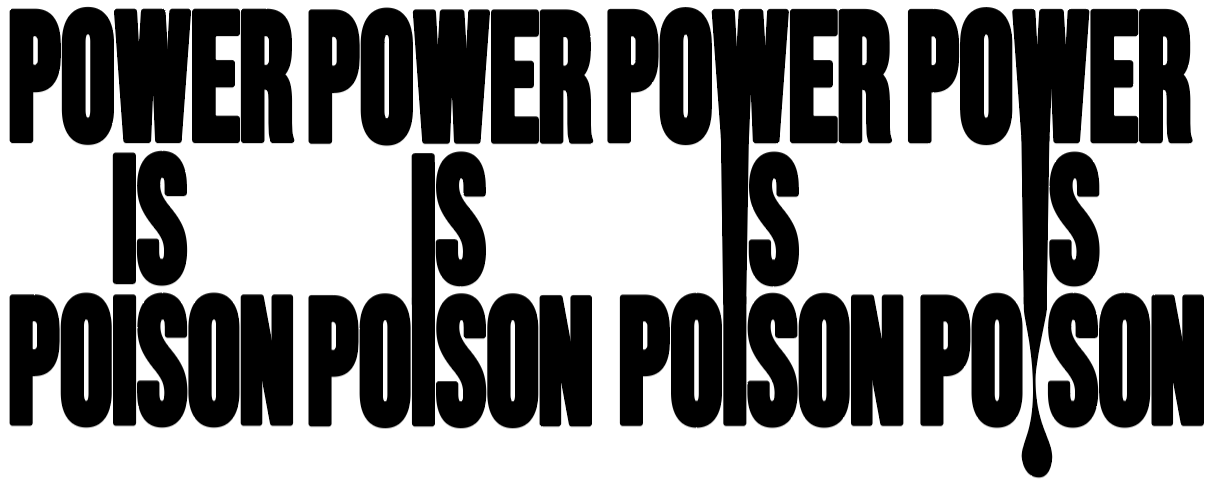
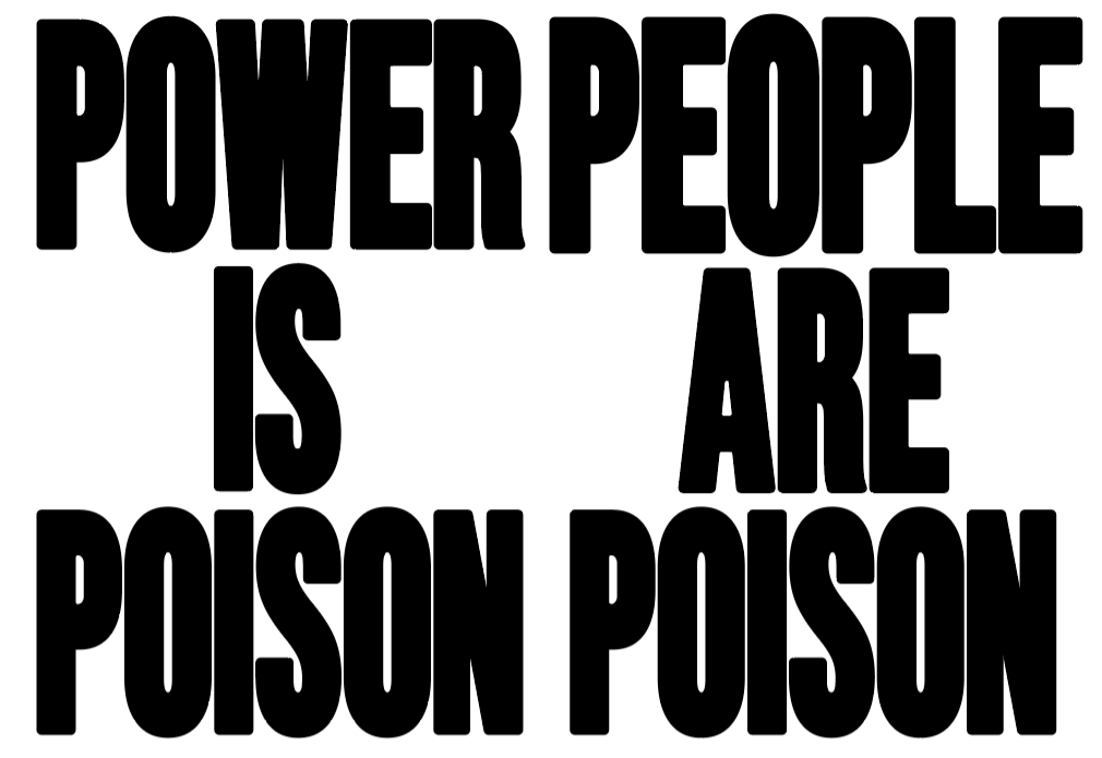
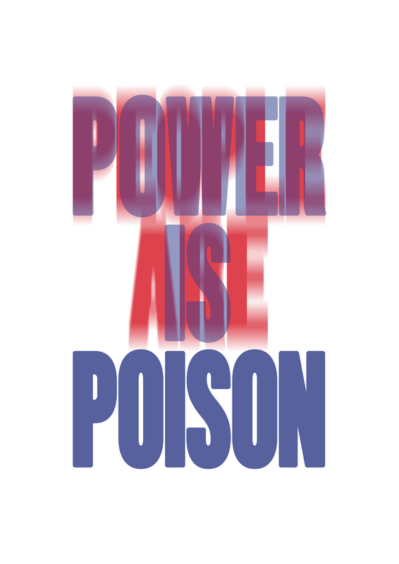
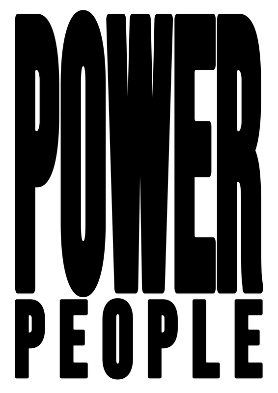
POWER

Brief

Your browser does not support viewing this document. Click here to download the document.
Chosen Brief: POWER

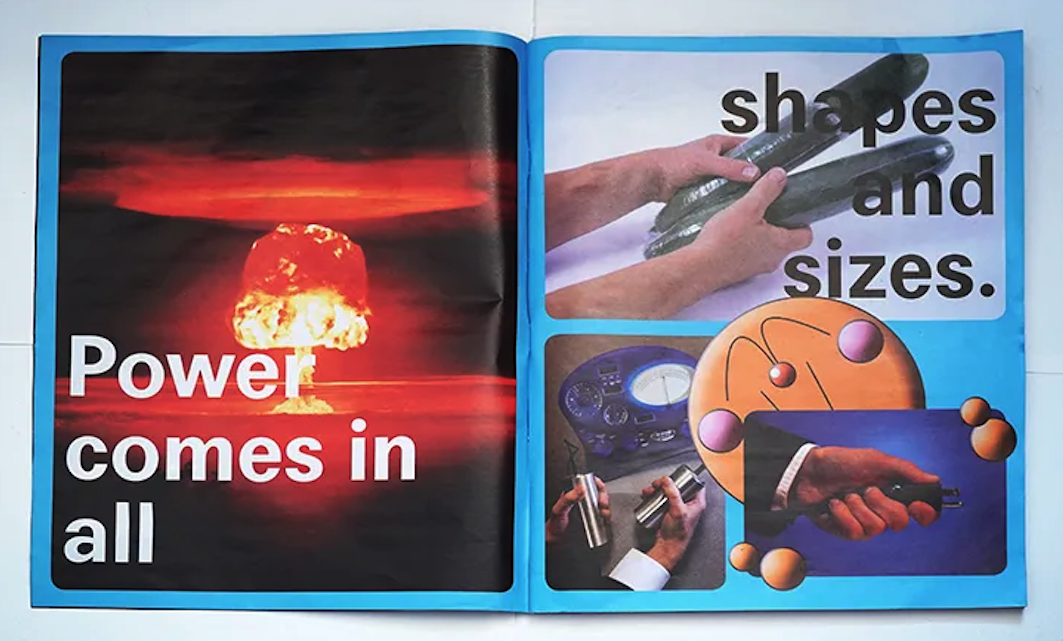
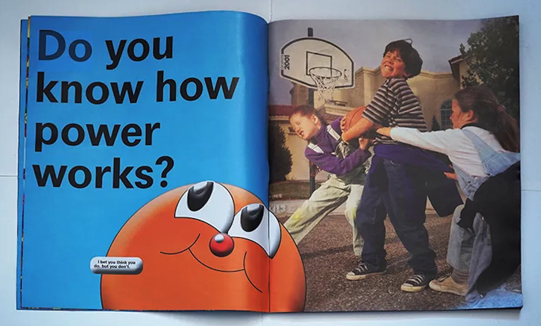
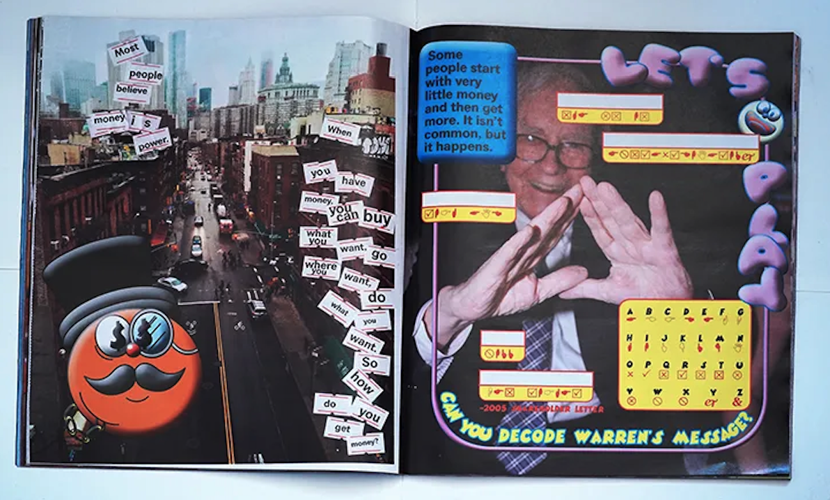
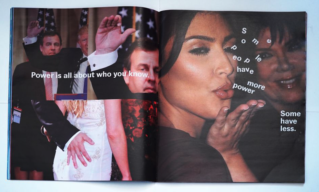
Artist Research

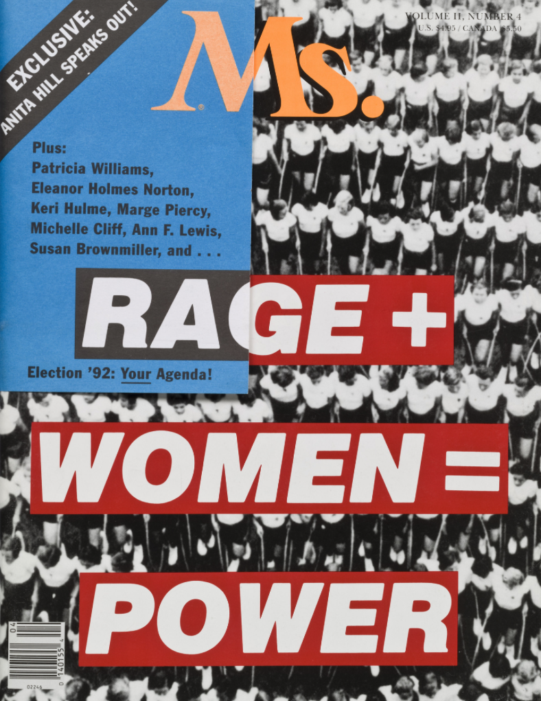
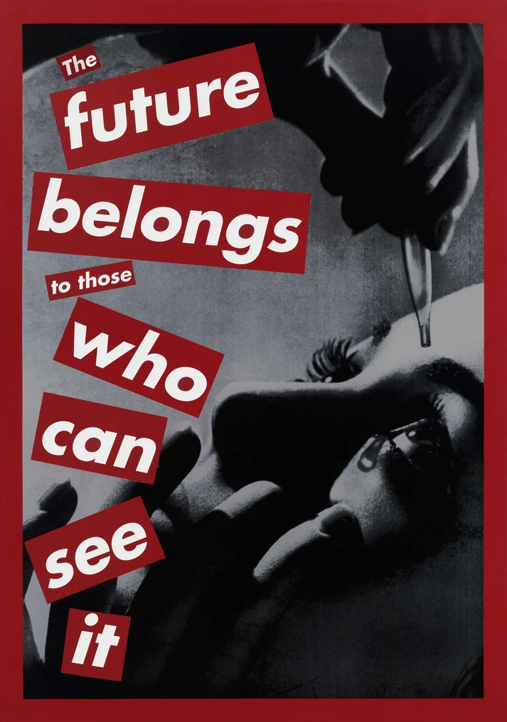
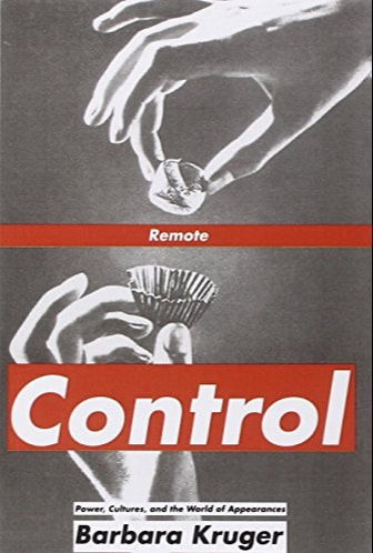
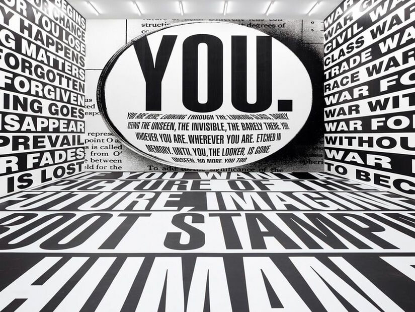
​Barbara Kruger
Picture
Picture
Picture
Picture
Picture
Jonathan Barnbrook
Picture
Picture
Picture
Picture
Picture
Tracy Ma
Picture
Picture
Picture
Picture

Other Research

Picture
Picture
Picture
Picture
Picture
Picture
Picture
Picture
Picture
Picture
Picture
Picture
Picture
Picture
View this post on Instagram

A post shared by Antonin Waterkeyn (@antonin.work)

View this post on Instagram

A post shared by Antonin Waterkeyn (@antonin.work)

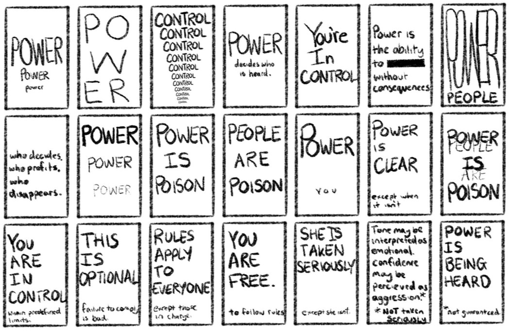
Idea Board

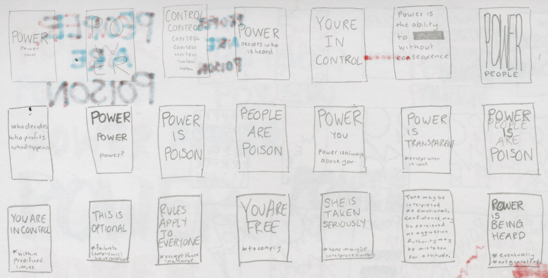
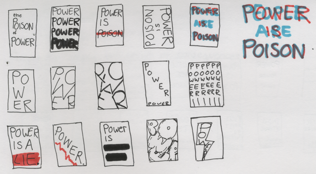
Sketches

Picture
Picture
Picture
Picture
Picture
Picture
Picture

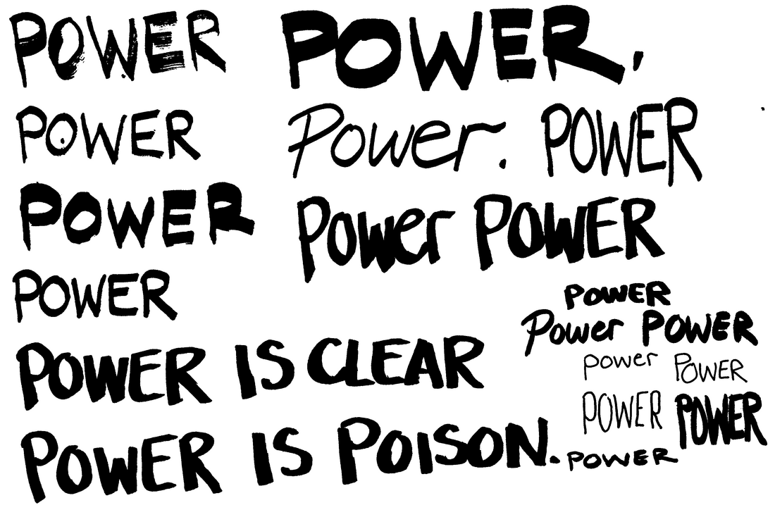
Design Development

Picture
Picture
Picture
Picture
Picture
Picture
Picture
Picture
Picture
Picture
Picture
Picture
Picture
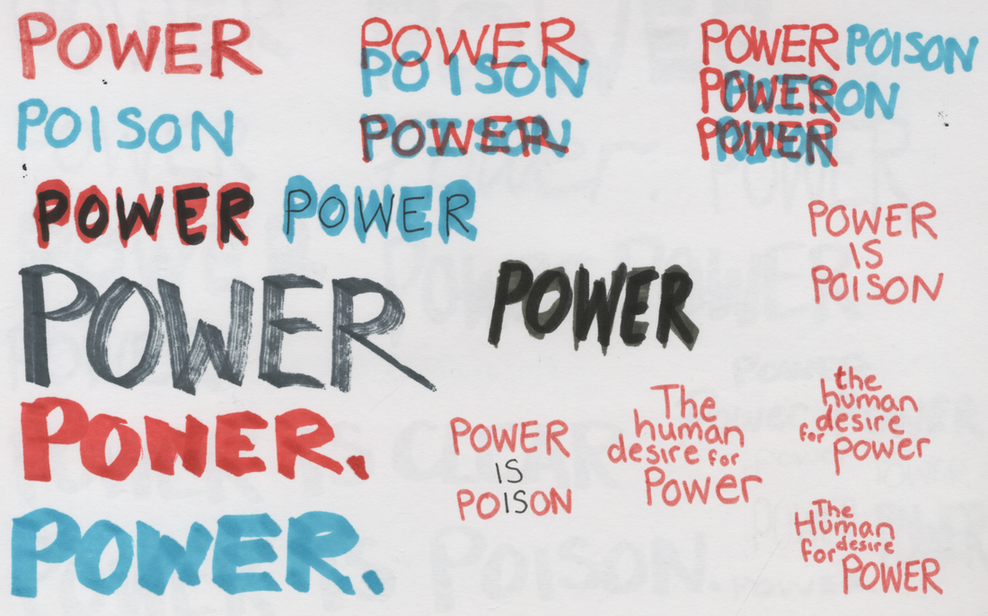
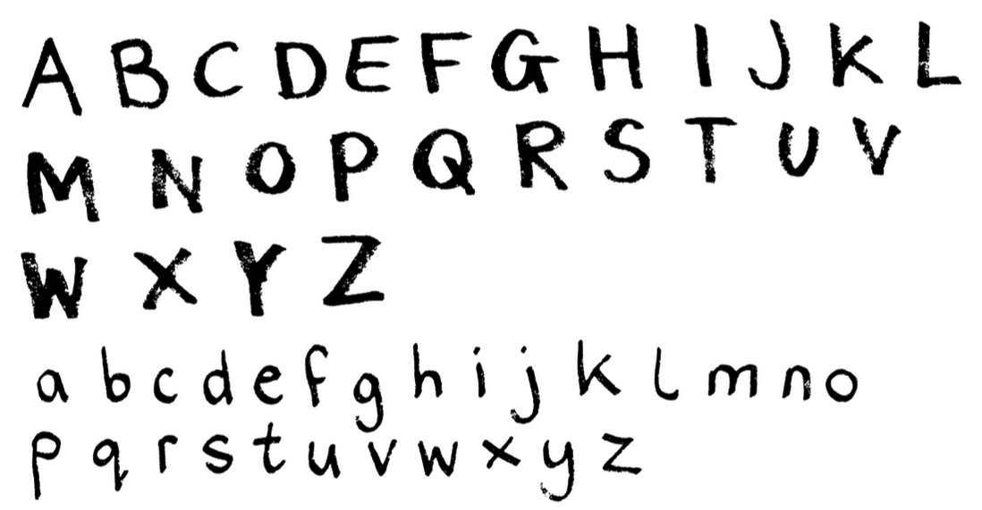
Experimenting with hand drawn type with markers for other poster ideas.
Picture
Picture
Picture
Picture
Continuing with my main idea using footnotes:

Specifications

Picture
Picture
Picture
Picture

Final Designs

Picture
Poster One

RULES APPLY TO ALL*

*does not include those in charge.
Poster Two

MAKE YOUR OWN CHOICE*

*failure to pick the right choice will result in consequences.
Picture
Picture
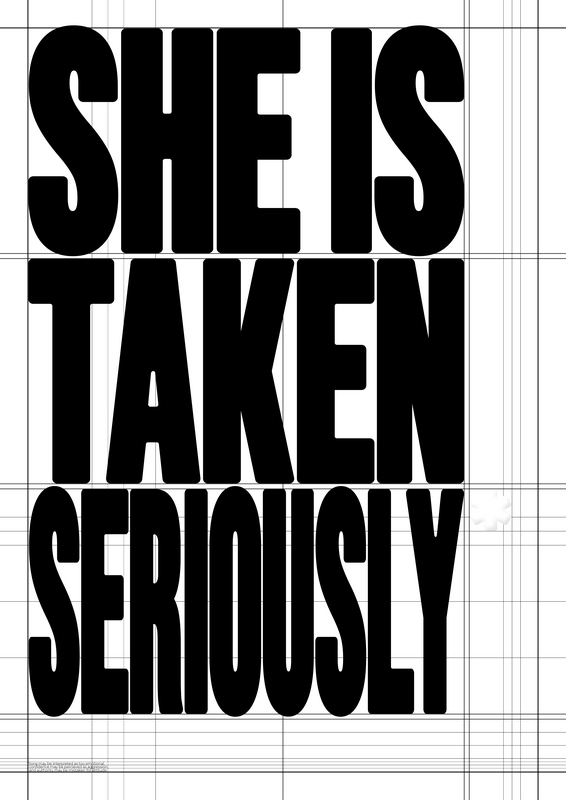
Poster Three

SHE IS TAKEN SERIOUSLY*

*tone may be interpreted as too emotional, confidence may be perceived as aggression, and authority may be mistaken for attitude.

Final Presentation

Your browser does not support viewing this document. Click here to download the document.
Site powered by Weebly. Managed by 34SP.com
  • Home
  • Year Two
    • Semester One >
      • Designer's Toolkit >
        • Alignment and Hierarchy
        • Contrast and Negative Space
        • Balance and Colour
        • Hotfoot >
          • Hotfoot Updated
      • Type and Typography >
        • Hierarchy and Layout
        • Magazine Layout
        • Responsive Digital Typography
    • Semester Two >
      • Graphic Design Projects >
        • D&AD
        • Museum Brand Identity
        • Information is Beautiful
        • West Walls Brewing Co.
      • The Critical Designer >
        • Research Blog
        • Essay
  • Year Three
    • Semester One >
      • Advanced Design Projects >
        • Zine
        • Motion Design
        • Industry Brief
    • Semester Two >
      • Final Projects >
        • ISTD Posters
        • Magazine
        • Café Branding
        • ♣ ♦ ♥ ♠
      • 2026 Degree Show