Brief
In this project, you will design a cohesive set of cards based on a chosen theme. The aim is to explore visual storytelling, typography, layout, and branding through a small but unified series. Your final outcome should demonstrate strong conceptual thinking, consistency across multiple pieces, and attention to detail in both digital and physical formats.
Target Audience
Young adults aged 18–25 who are visually engaged, socially active, and interested in creative or expressive content. They value bold design, relatable themes, and aesthetically cohesive visuals, often using cards for personal enjoyment, self-expression, or social sharing.
Requirements
Target Audience
Young adults aged 18–25 who are visually engaged, socially active, and interested in creative or expressive content. They value bold design, relatable themes, and aesthetically cohesive visuals, often using cards for personal enjoyment, self-expression, or social sharing.
Requirements
- Final card set
- Process work
- Mockups or printed presentation
Research
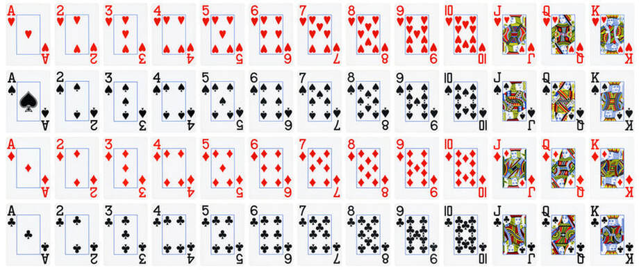
52 Cards Total - With Jokers 54
Four suits, each containing 13 cards
Ace, 2, 3, 4, 5, 6, 7, 8, 9, 10, Jack, Queen, King.
Four suits, each containing 13 cards
Ace, 2, 3, 4, 5, 6, 7, 8, 9, 10, Jack, Queen, King.
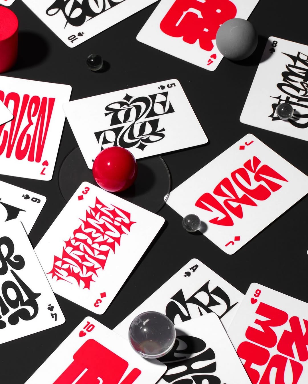
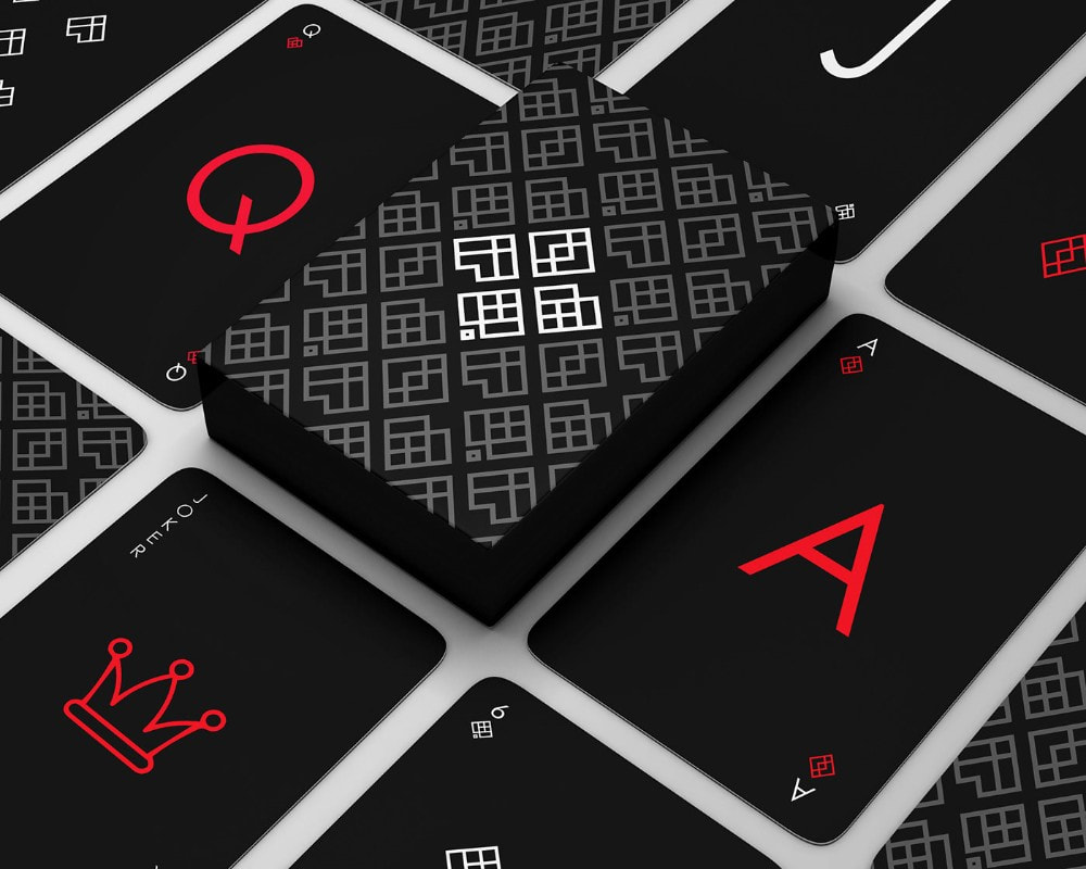
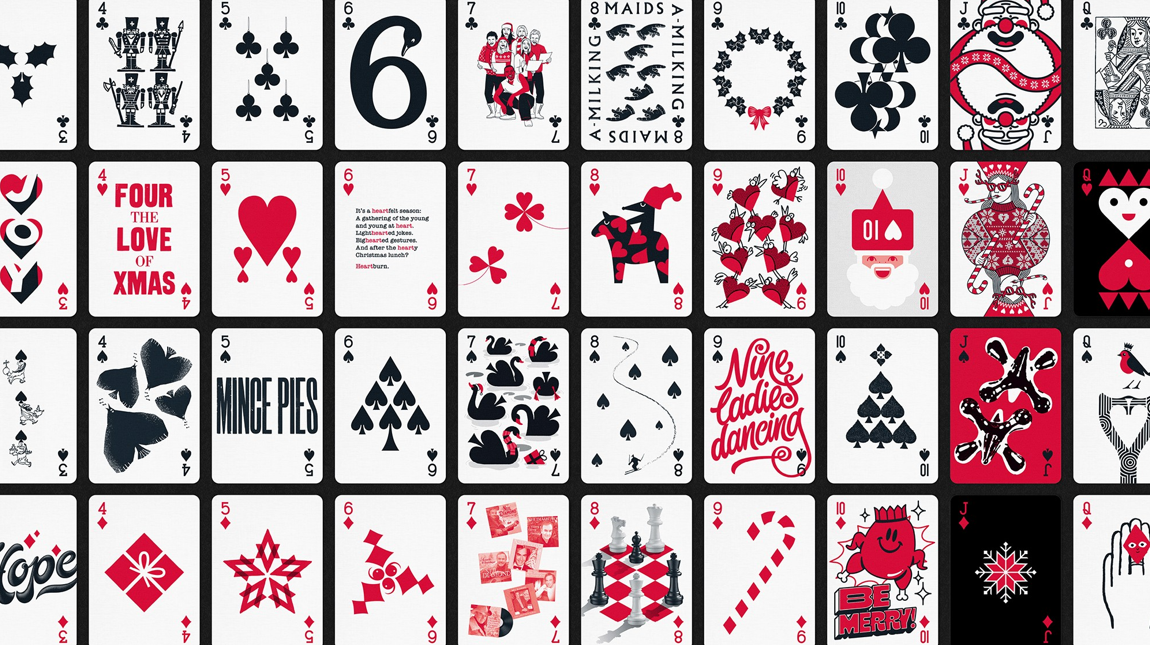
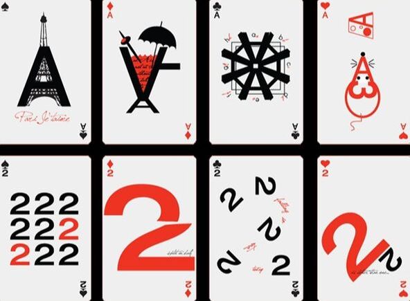
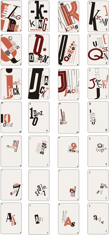
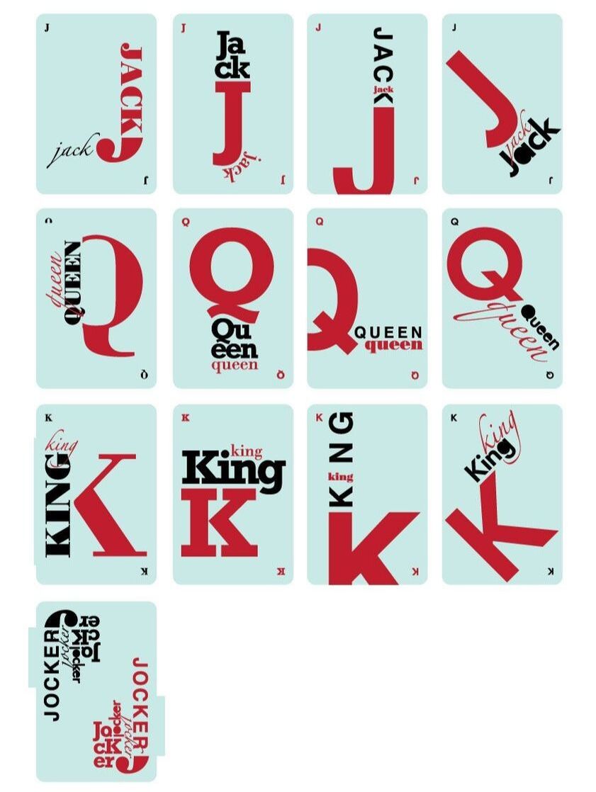
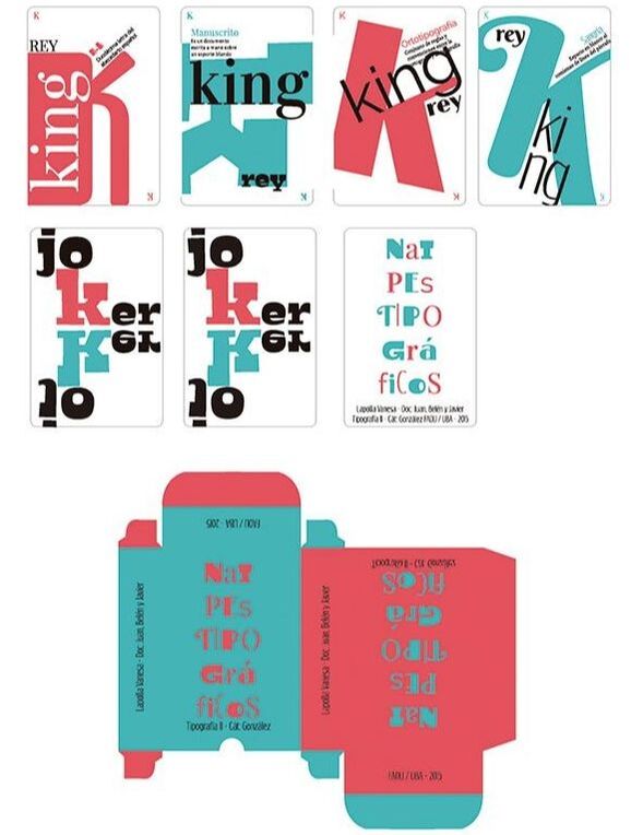
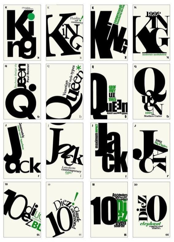
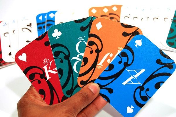
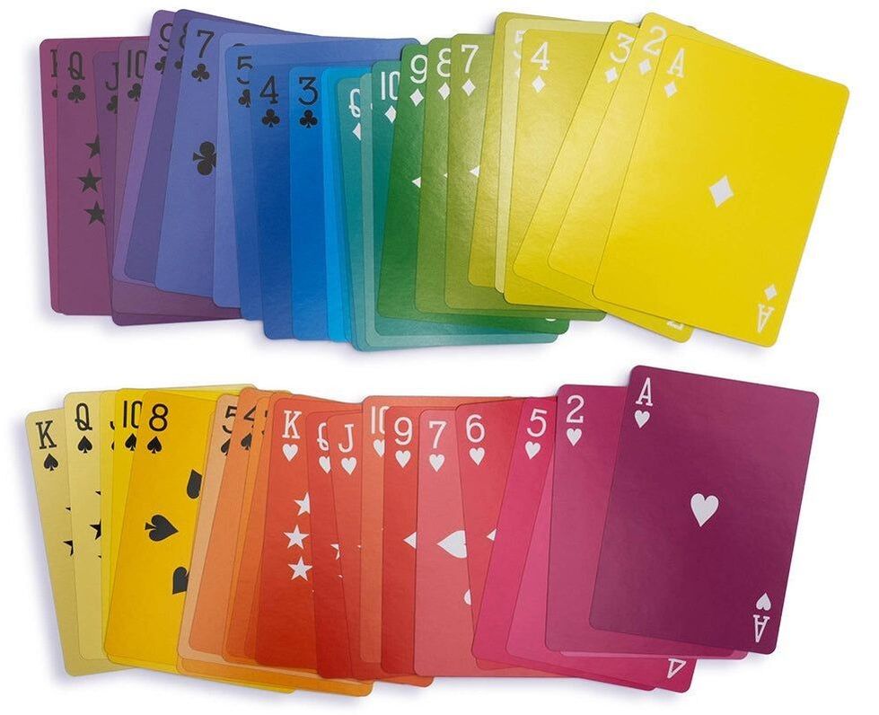
Type Cards
|
|
|
|
|
|
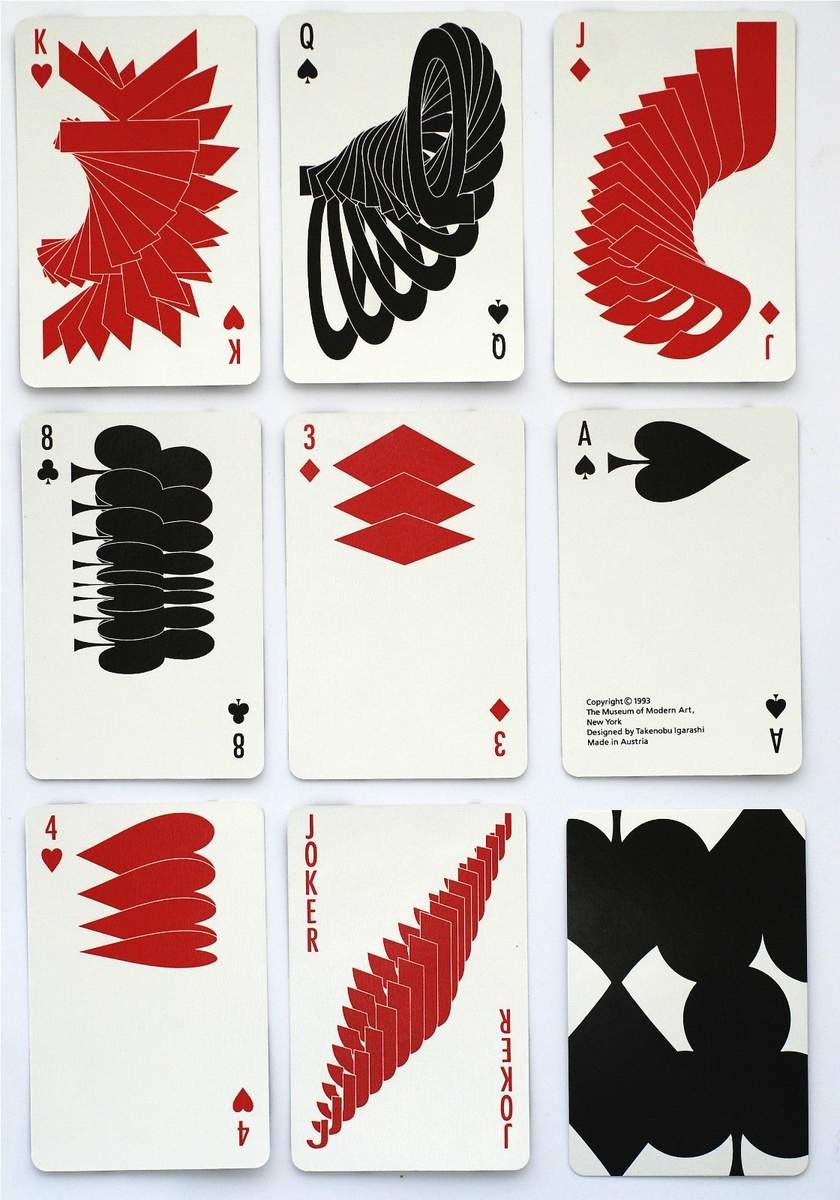
|

|
|
|

|
|

|
|
|
|
|
|
|
|

|
|
|
|
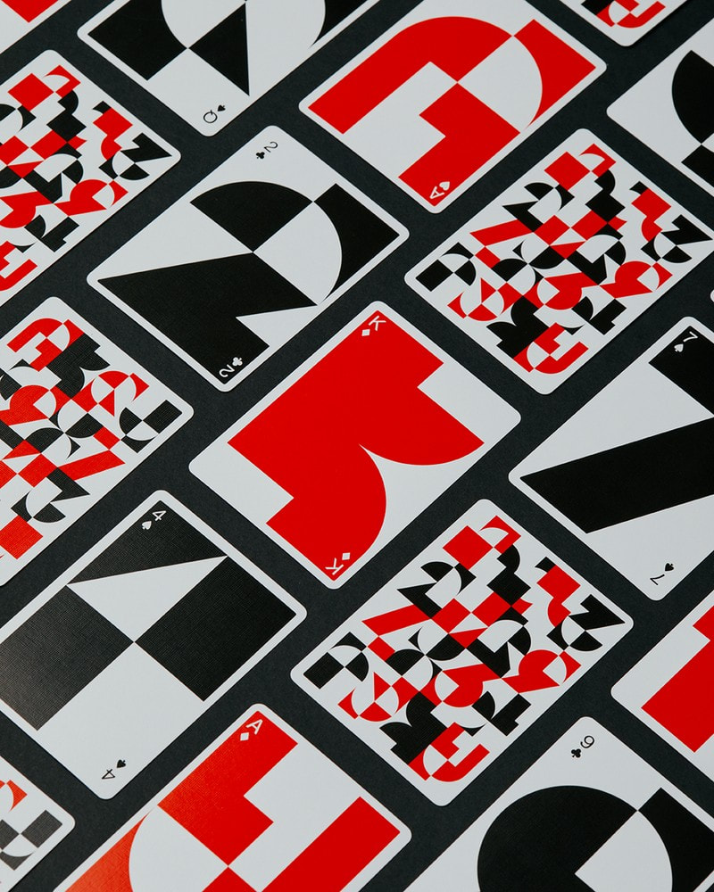
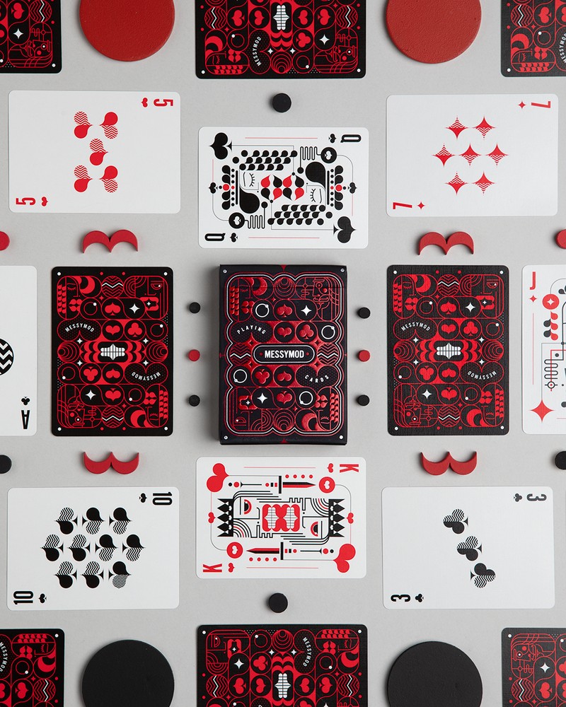
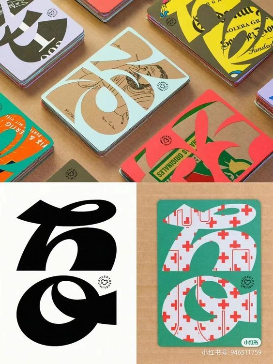
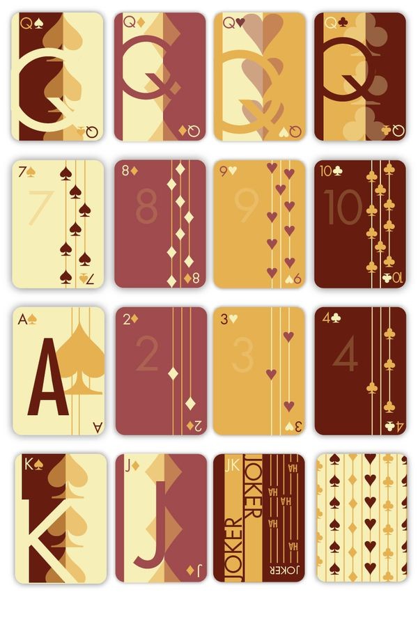
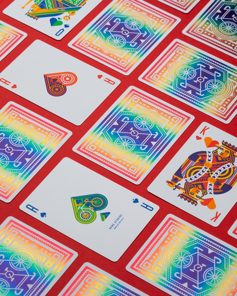
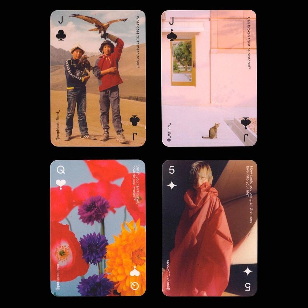
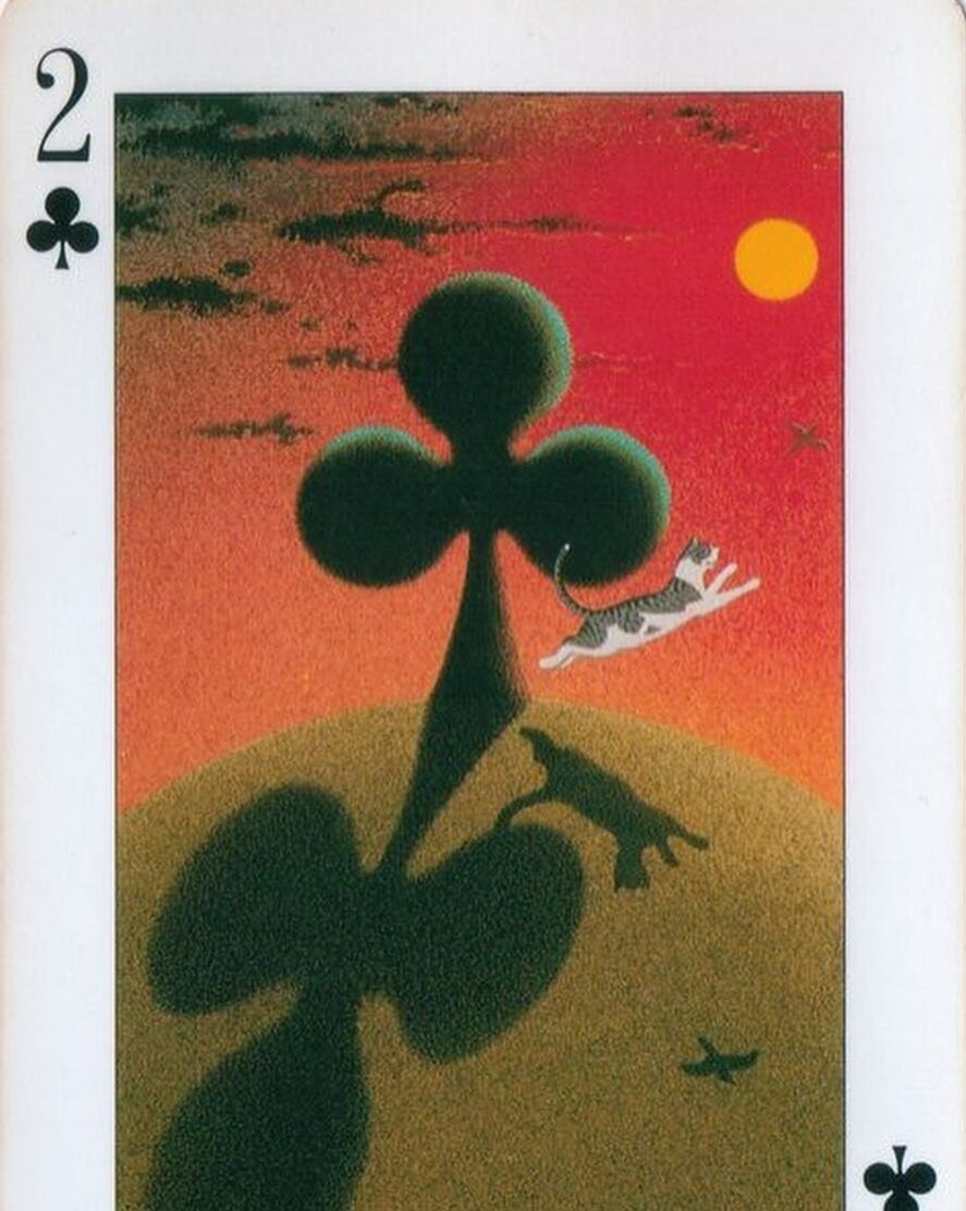
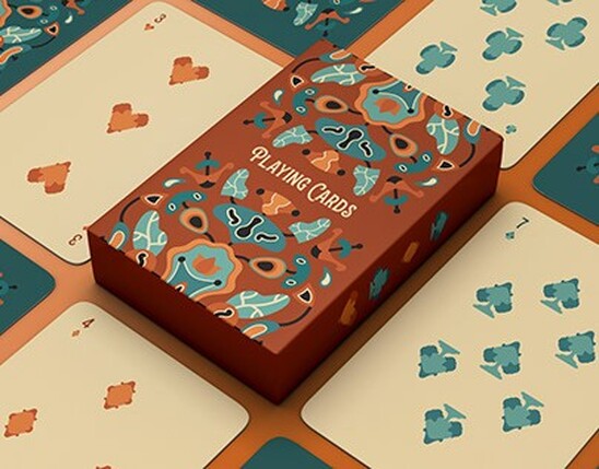
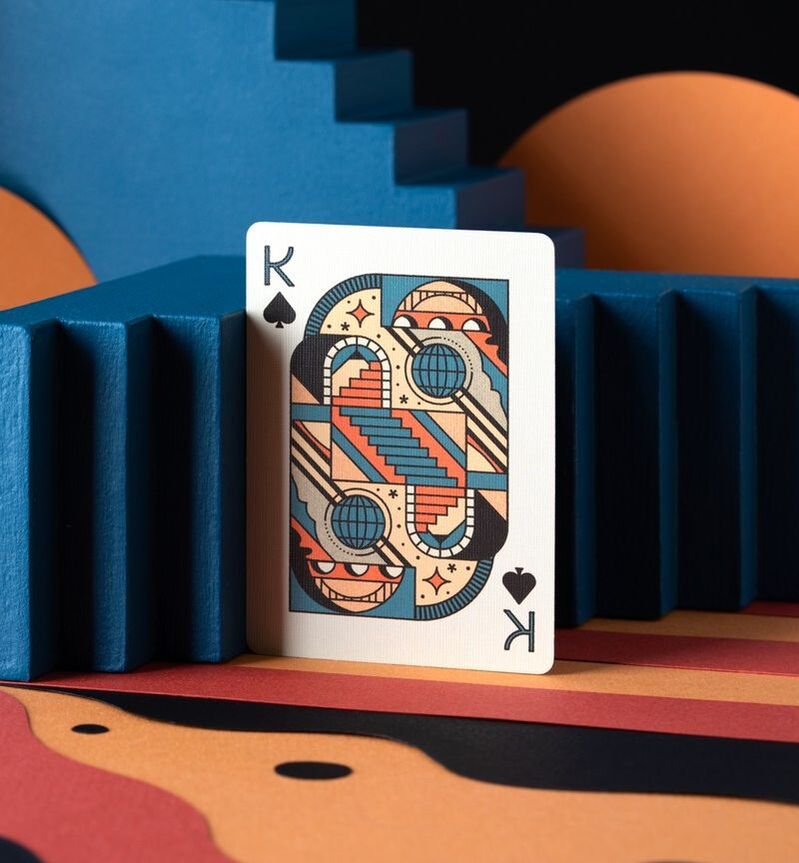
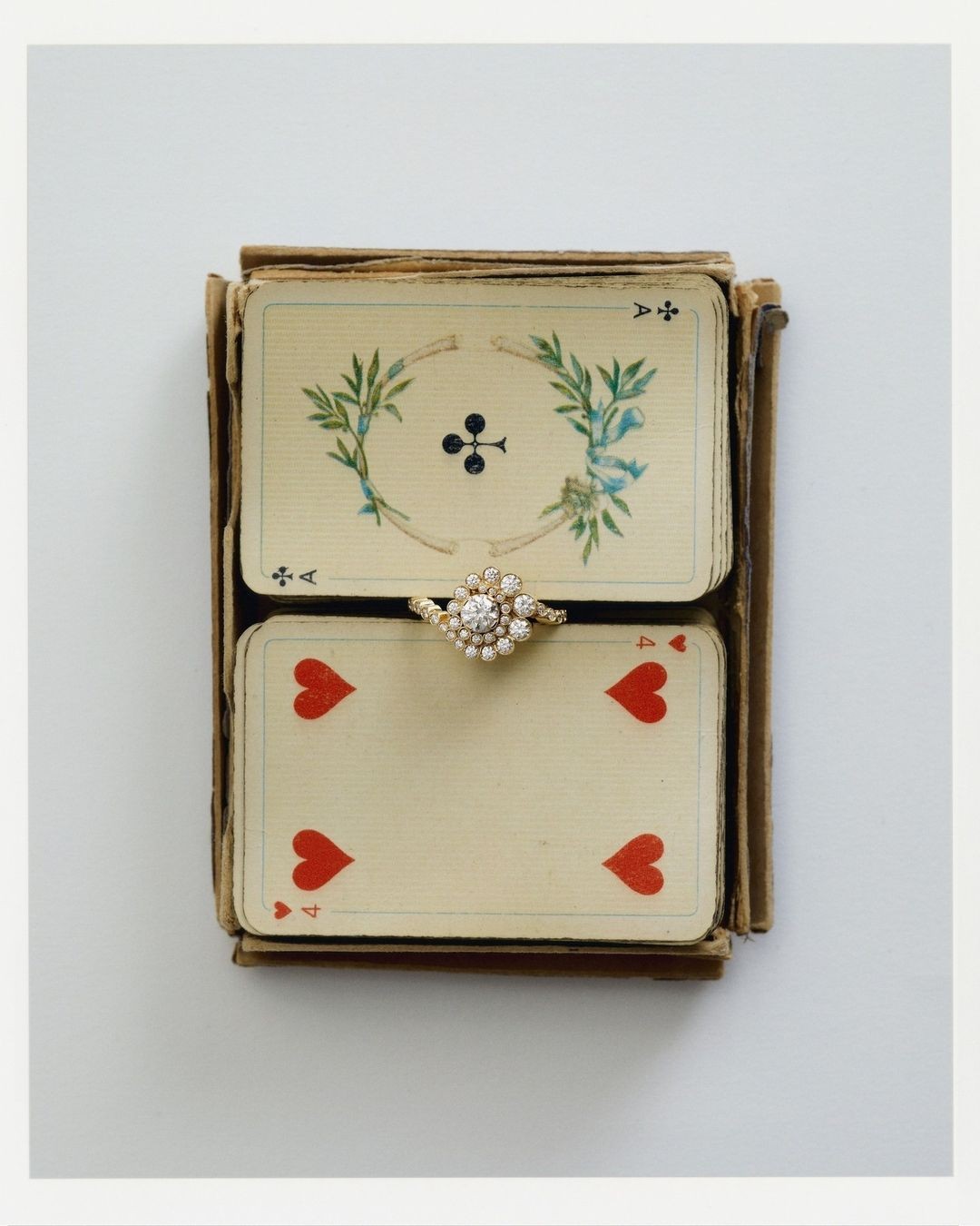
Abstract Cards
|
|

|
|
|
|
|
|
|
|

|
|
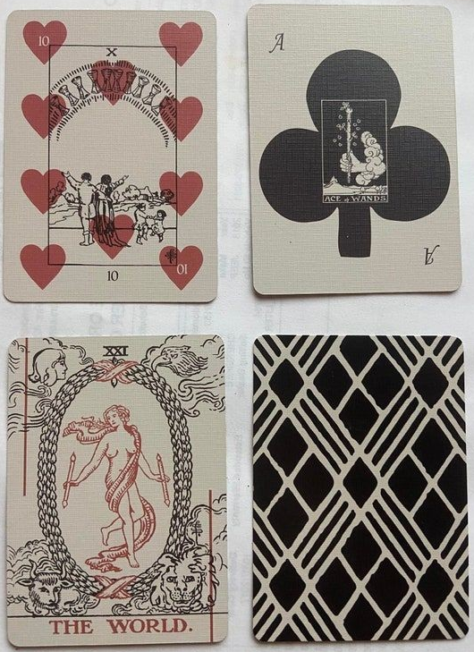
|
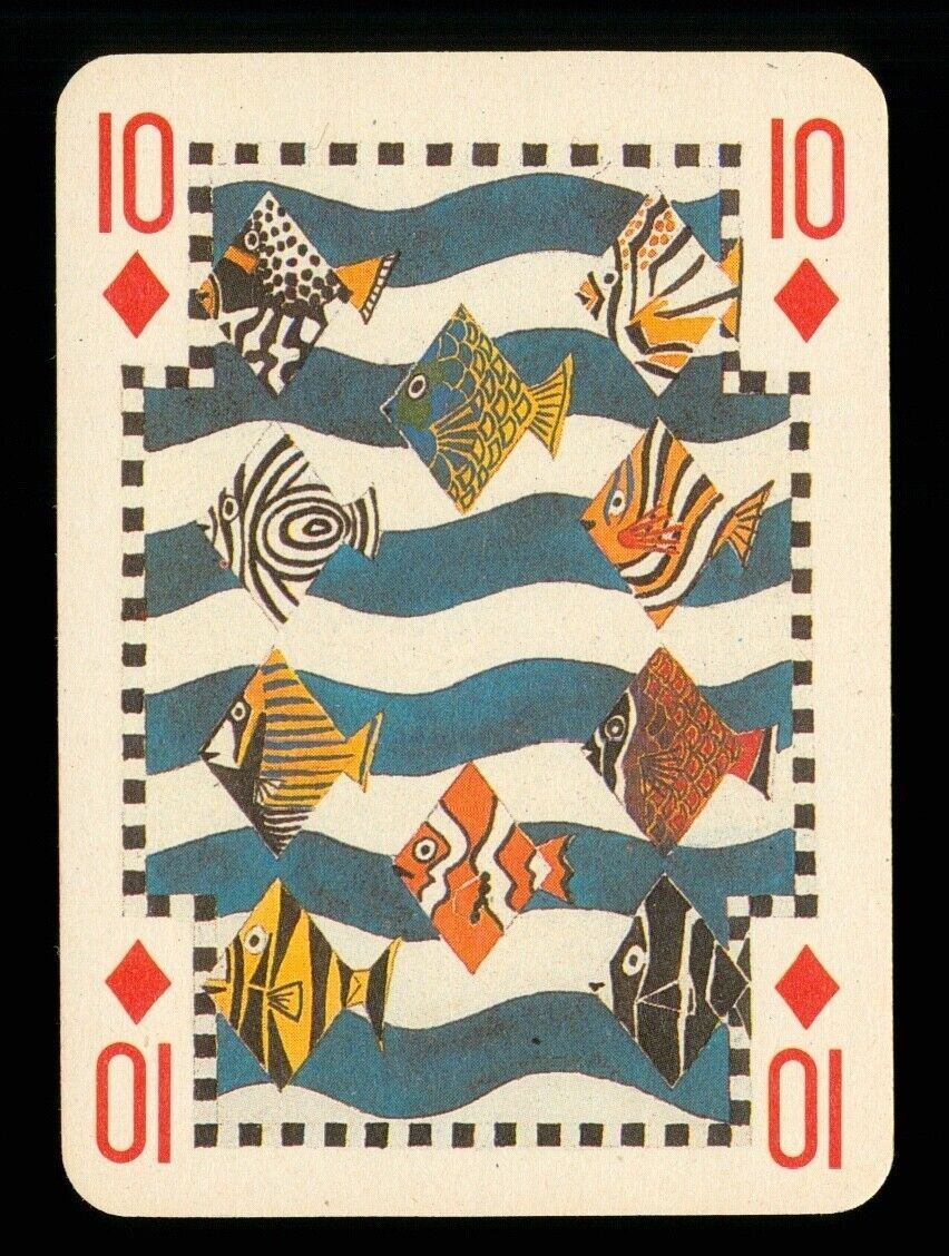
|
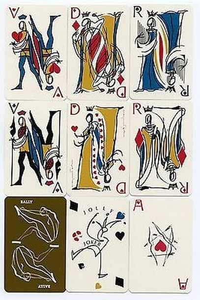
|
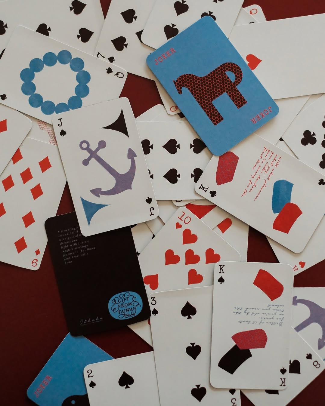
|

|
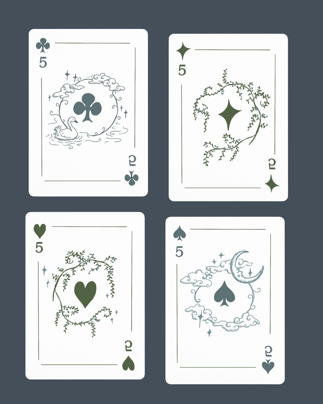
|
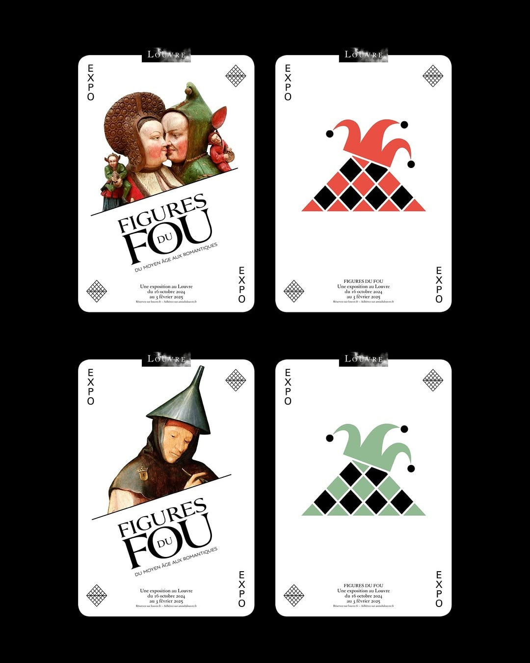
|
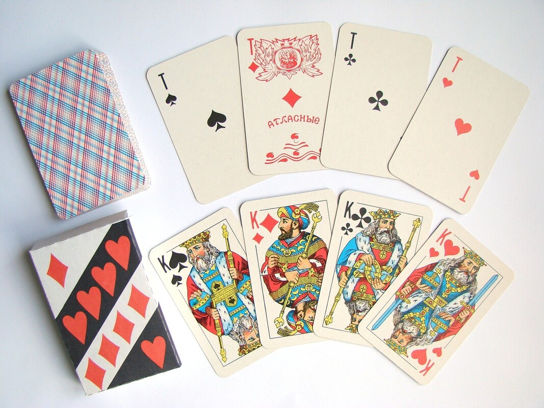
|
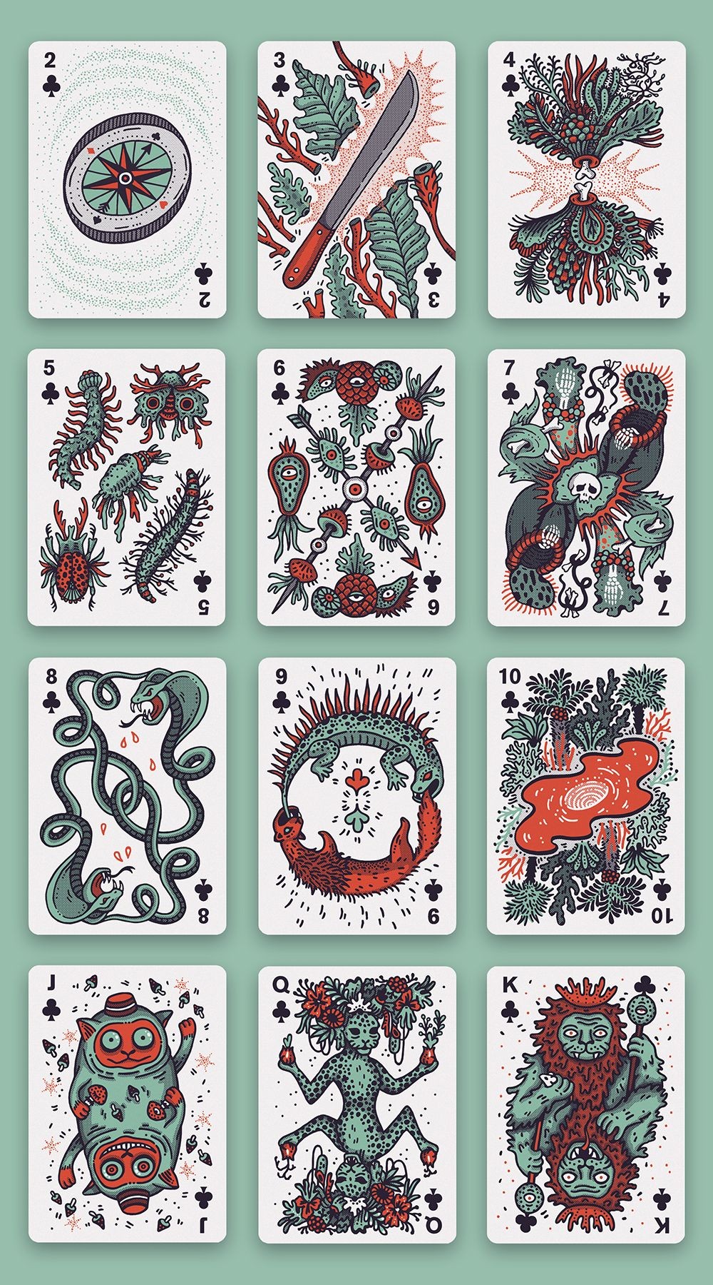
|

|
Figma Board
Design Development
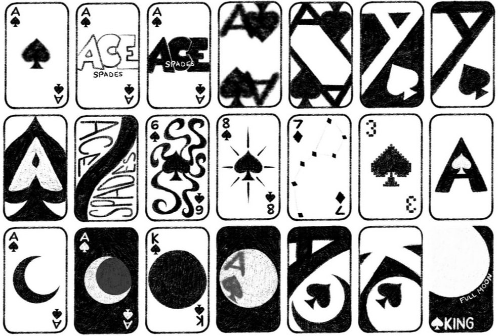
Card Design Idea

|
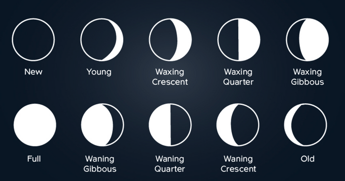
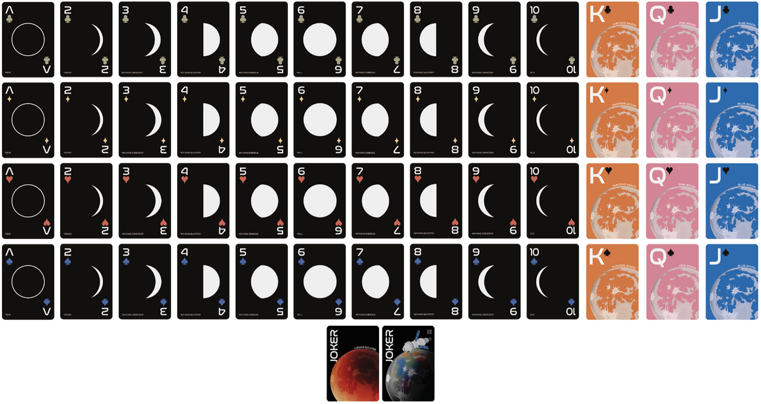
While doing my research I found all these phases of the moon fit between Ace and 10, this created the perfect opportunity to make my suit based on this. Therefore the face cards - King, Queen, Jack and the Joker cards can be different full moons.
|
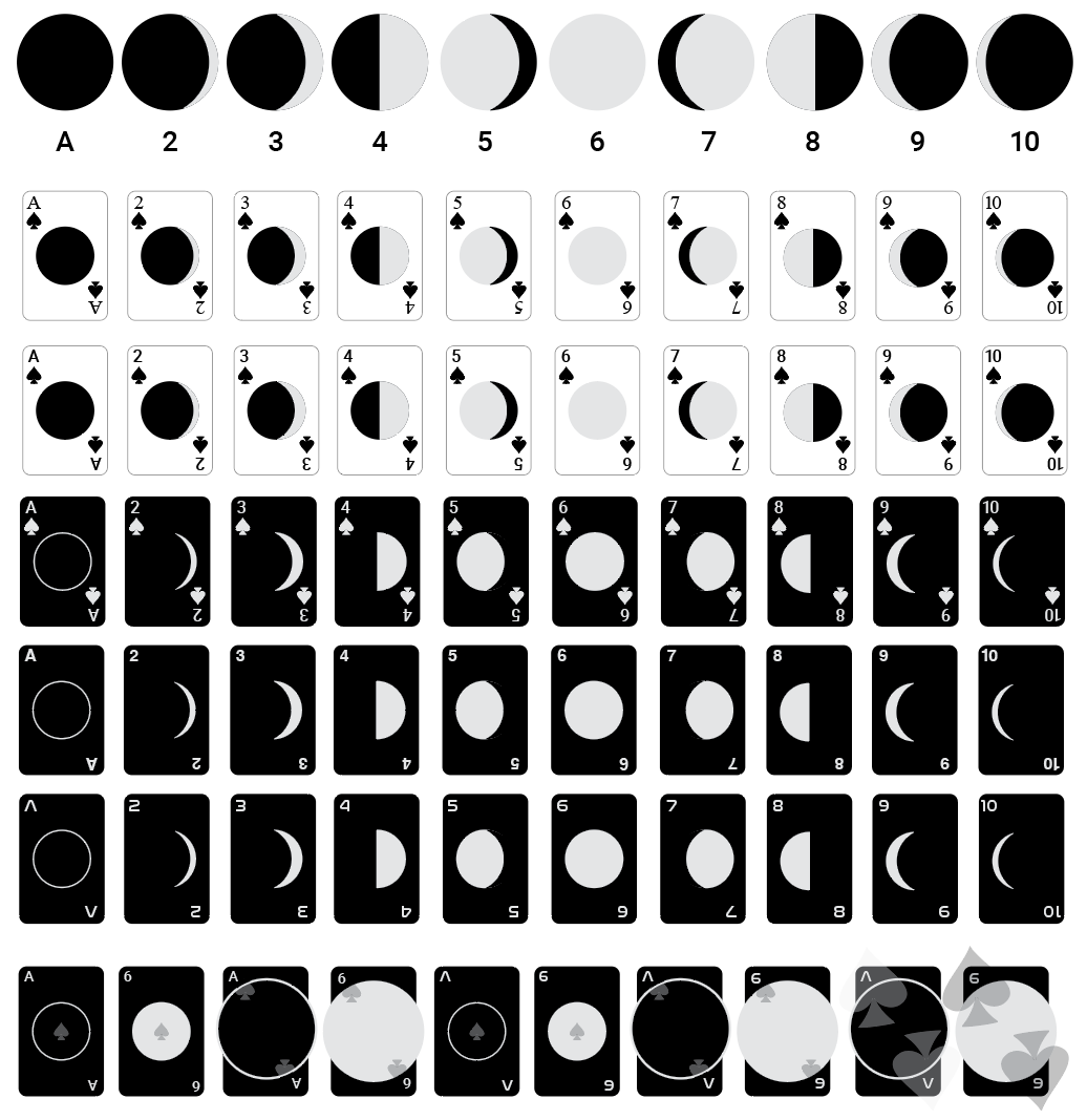
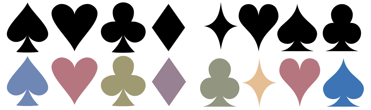
After experimenting with the layout of the numbers and moon, I found that the best version was keeping it simple as it was the most effective and best looking for the set.
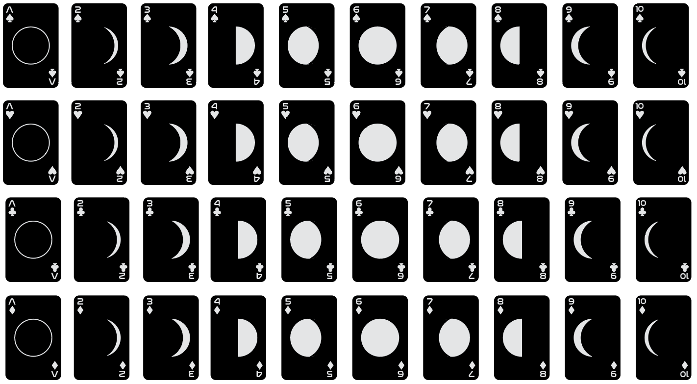
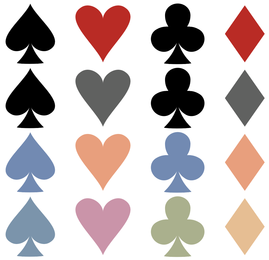
Together this first version of the set did have the layout however, the suit icons I made did not fit with the NASA typeface. So, I redesigned them and added colour picked from the moon to make it clear which card belongs to which suit.
|
|
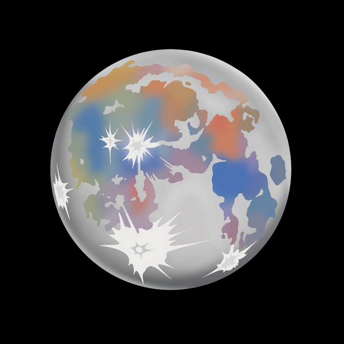
Moon Illustration
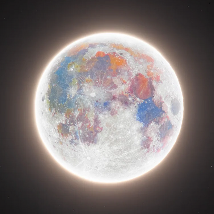
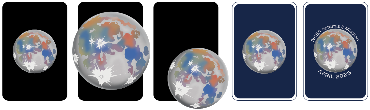
To begin with my set of cards was just going to be based on the phases of the moon and types of full moon, however with the recent trip by Artemis II this created the perfect opportunity to make a special edition set inspired by Artemis and the newest picture they took of the moon.
|
Image taken from Artemis II
|
My Illustration
|
Face Cards
|
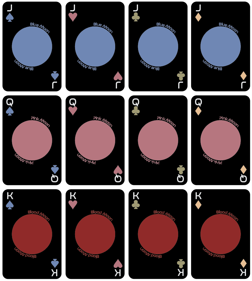
For my first designs for the face cards, I wanted to make them cohesive with the rest of the cards however, this meant they did not stand out as much as I wanted them to. The colours from the suits also did not go with the colour of the full moon paired with the card. After advice from tutors, I will make them stand out with a different background colour and integrate my moon illustration with these cards.
|
Back to Sketching Ideas
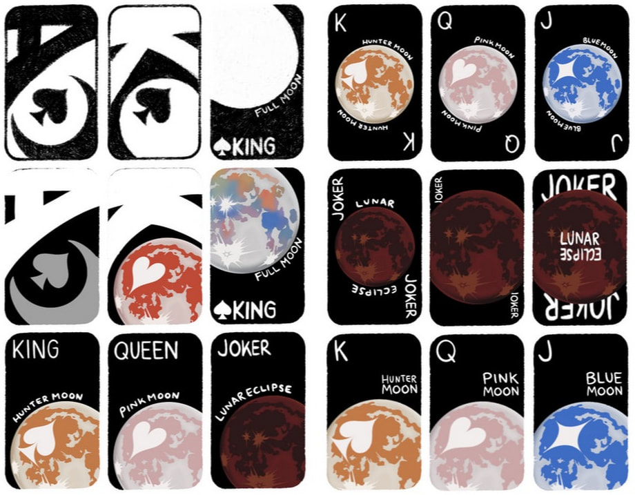
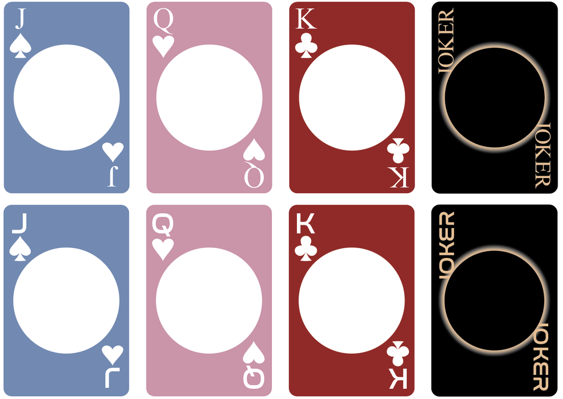
Different Face Card Designs
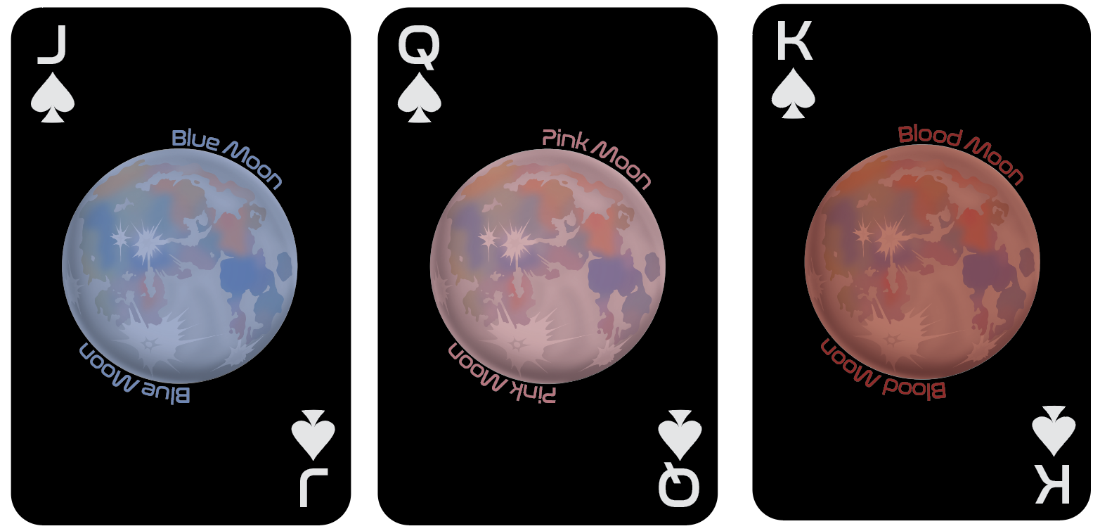
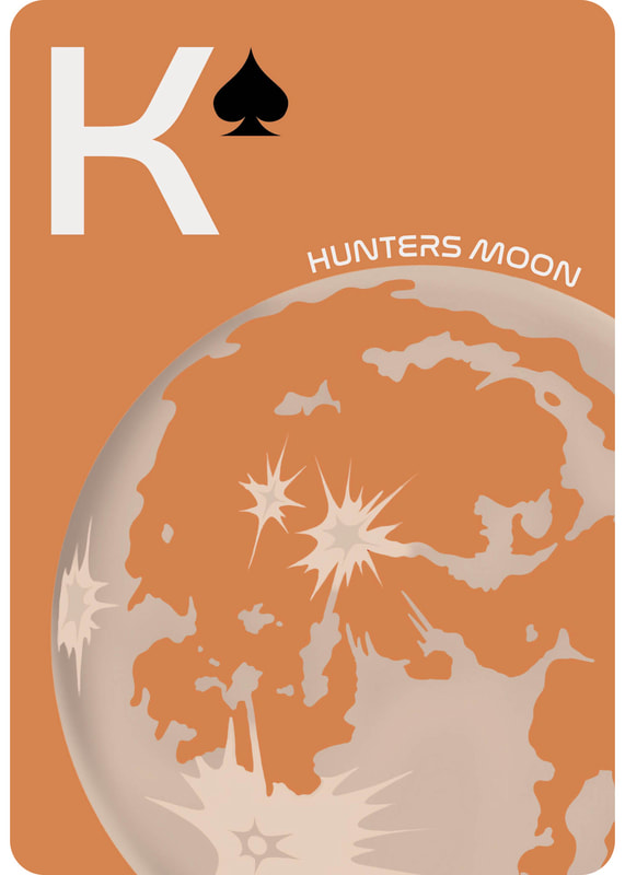
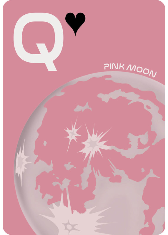
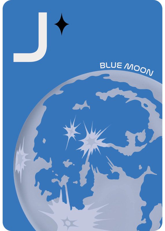
As well as keeping the design simple, I made small adjustments to the colours of the cards so they are similar hues, this also helped keep them vibrant when printing.
Final King, Queen and Jack
|
|
|
Jokers
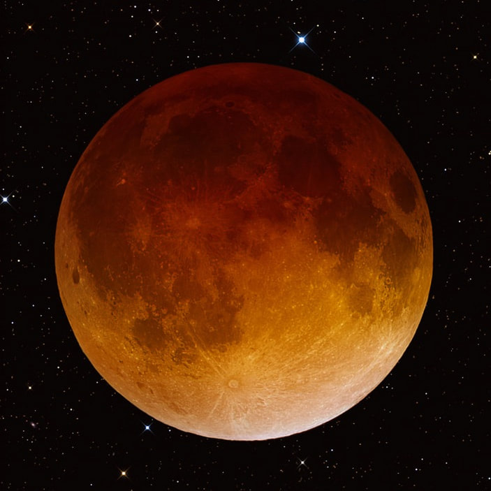
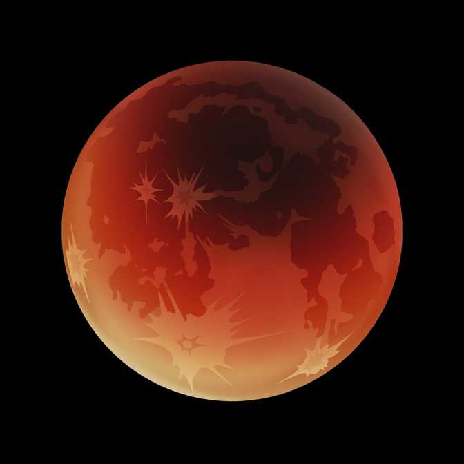
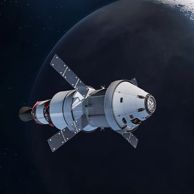
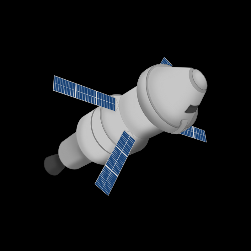
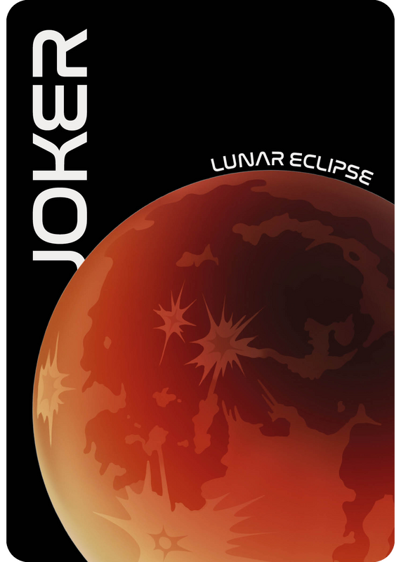
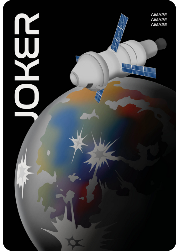
Originally, I had the intention to have two identical jokers - both being the total luna eclipse. However, I found that the standard set of cards includes two different designed jokers with one being more 'powerful' than the other when it comes to playing games. Therefore, instead of just having the luna eclipse I also made an illustration of the Artemis II ship which took them around the moon to include in the higher status joker. This not only links back to the set being about Artemis II, it makes this deck more cohesive.
|
|
As well as making an illustration of the moon and eclipse, I made one of the Artemis II ship!
|
|
Final Jokers
|
|
Card Reverse
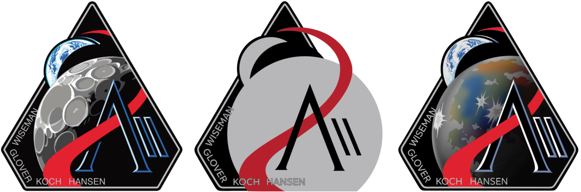
Instead of using the official badge for Artemis II, I remade it in illustrator with my design of the moon and earth to fit with the rest of my cards.
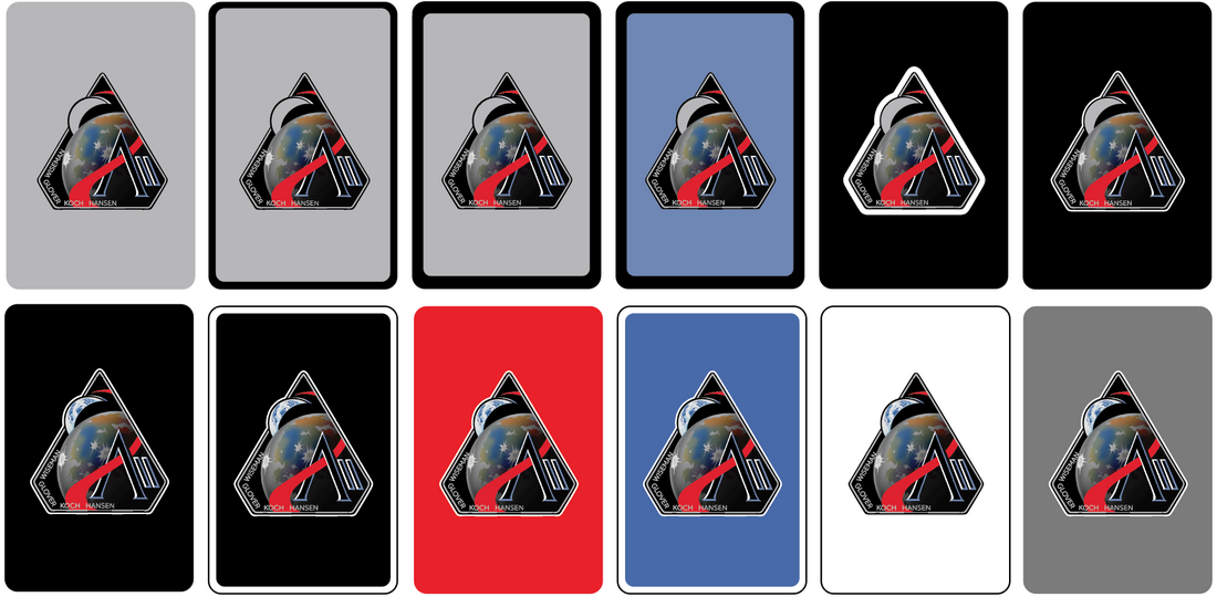
Keeping it simple is what works best for these cards, the contemporary feel gives it the special edition look that it needs. This meant the best design is the badge on a plain black background.
Final Reverse of Cards Design

Box Design

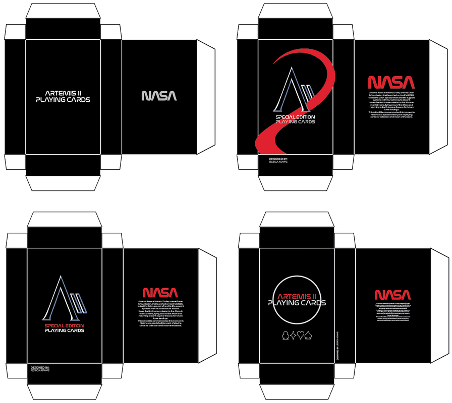
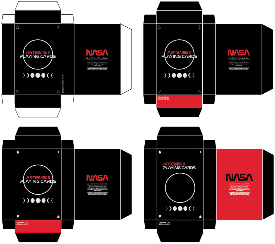
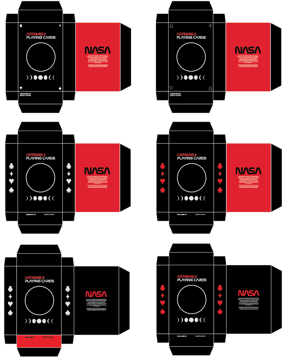
At first, the box design started as a simple, standard box - not reminiscent of a special edition pack. So this was when I included Artemis II into the design.

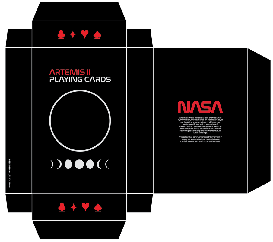
Final Box Design
|
The text on the back of the box reads:
Artemis II was a historic 10-day crewed lunar flyby mission, that launched on April 1st 2026, to test the Orion spacecraft and its life-support systems with four astronauts aboard. It was the first human mission to the Moon in over 50 years, flying around the Moon and returning to Earth to pave the way for future lunar landings. This collectible commemorates this moment in history as a special edition pack of playing cards for collectors and moon enthusiasts. |